
UI设计开发组件工程化
介绍
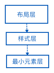
在移动应用开发中,业务的不断演化,交互界面也跟着变更、改版和换肤,为了面对这种变化而带来较大的开发成本,从可维护性、复用性的角度去思考 UI 设计和项目架构组件工程化。UI 设计组件工程化设计分为三层:最小元素层、样式层、布局层,通过分层隔离的方式达到解耦、复用、较小成本应对需求的升级变化。布局层依赖样式层,样式层依赖最小元素层,最小元素层是具体基础的视觉元素。下面介绍关于这三层的划分,以及在 Android 平台上的实现。
最小元素层
最小元素是设计或编码上不可再细分的度量单位。最小元素有:主题色、背景色、高亮色、文字主颜色、文字次要颜色、分割线颜色、页面边距、可点击组件边距、不可点击组件边距……
明确了最小元素后,将这些最小元素抽离出来,赋予有意义的名称,放置在资源文件中。一般性,好的设计,最小元素的数量不会有太多。因此不用担心定义过多的最小元素。在编码过程中,使用这些最小元素通过引用资源文件预定义好的常量值,不要硬编码写死。使用与定义分开,不关心最小元素具体值,只管引用元素值的资源 ID。依赖资源 ID 的好算是,一处改动全局生效,换肤无痛。
最小元素创建
colors.xml:定义最小元素的主题色、背景色、主文本颜色、次文本颜色……
1
2
3<color name="colorPrimary">#393A3F</color>
<color name="colorPrimaryDark">#393A3F</color>
<color name="colorAccent">#31C131</color>dimens.xml:定义最小元素的页面边距、标题与内容的文本大小、圆角矩形半径……
1
2
3<dimen name="activity_horizontal_margin">16dp</dimen>
<dimen name="activity_vertical_margin">16dp</dimen>
<dimen name="round_rect_radius">3dp</dimen>ids.xml:定义组件 id。
1
2
3<item name="recycler_view" type="id"/>
<item name="swipe_refresh_layout" type="id"/>
<item name="msg_tv" type="id"/>strings.xml:定义字符串文件。
1
<string name="app_name">UI 组件工程化的实现</string>
样式层
样式的创建是把最小元素组合起来,创建好的样式供布局文件使用。使用样式的好处是,复用与统一集中管理。对于有差异的组件样式,利用重载机制进行重写或扩展。
样式实现
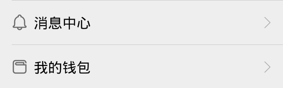
以实现消息中心组件为例子,讲讲在 Android 平台上的实现,消息中心组件中包含了四个组件,分别是最外层的容器(Layout)、左侧的小图标和标题(TextView 组件可同时设置 icon 和 title)、右侧的箭头(ImageView),分割线(View)。把创建的样式存放在 style.xml 文件中,每一个样式可以包含组件的宽高、字体大小颜色、边距、相对位置等。
外层容器样式
1
2
3
4<style name="ItemLayoutStyle">
<item name="android:layout_width">match_parent</item>
<item name="android:layout_height">wrap_content</item>
</style>
标题样式
1
2
3
4
5
6
7
8
9<style name="ItemTitleStyle">
<item name="android:id">@id/title_tv</item>
<item name="android:layout_width">wrap_content</item>
<item name="android:layout_height">wrap_content</item>
<item name="android:textSize">@dimen/item_text_size</item>
<item name="android:textColor">@android:color/black</item>
<item name="android:layout_margin">@dimen/activity_horizontal_margin</item>
<item name="android:drawablePadding">@dimen/item_drawable_padding</item>
</style>
箭头样式
1
2
3
4
5
6
7
8
9<style name="ItemArrowStyle">
<item name="android:layout_width">wrap_content</item>
<item name="android:layout_height">wrap_content</item>
<item name="android:src">@drawable/ic_right_arrow</item>
<item name="android:layout_alignParentEnd">true</item>
<item name="android:layout_centerVertical">true</item>
<item name="android:layout_marginStart">@dimen/activity_horizontal_margin</item>
<item name="android:layout_marginEnd">@dimen/activity_horizontal_margin</item>
</style>
分割线样式
1
2
3
4
5
6
7<style name="ItemDividerStyle">
<item name="android:layout_width">match_parent</item>
<item name="android:layout_height">@dimen/divider_height</item>
<item name="android:layout_marginStart">@dimen/activity_horizontal_margin</item>
<item name="android:background">@android:color/darker_gray</item>
<item name="android:layout_below">@id/title_tv</item>
</style>
可以看到这几个样式定义,没有硬编码使用具体的属性值,都是通过引用创建好的样式资源。
布局层
布局层的专注点是创建组件,定位组件。通用的外观直接引用样式,特殊差异的属性值可以选择性的在样式文件继承重写或在布局文件中设置。
布局实现
1 | <!-- 相对布局 --> |
可以看到布局层的代码量已经大大减少了,布局层的编码只有少量或没有元素具体值的存在。在这个布局文件中,组件相同的属性都是从样式文件中引用来的。目前为止,布局文件把每一项使用到组件都暴露出来,很分散,如果想在每个向右箭头增加状态描述,那样修改起来会很麻烦。把 icon、标题、向右箭头看成一个不可分的整体,封装在一个组件中,布局文件引用自定义组件,使代码更加内聚,修改扩展成本更小。每一项视图有差异的是 icon、标题、是否显示分割线,把三个属性是变量,提取出来后,把样式变量放到 attrs.xml 中。接着,实现解析自定义属性,赋予组件使其生效。最后,在布局文件中使用自定义组件。
创建自定义属性
1
2
3
4
5<declare-styleable name="ItemLayout">
<attr name="icon"/>
<attr name="title"/>
<attr name="showDivider" format="boolean"/>
</declare-styleable>解析与使用自定义属性
1
2
3
4
5
6
7
8
9
10
11
12
13
14
15
16
17
18
19
20
21
22
23
24
25
26
27
28
29
30
31
32
33
34
35
36
37
38
39public class ItemLayout extends RelativeLayout {
public ItemLayout(Context context, AttributeSet attrs) {
super(context, attrs);
init(context, attrs);
}
private String title;
private Drawable iconDrawable;
private boolean showDivider;
private void init(Context context, AttributeSet attrs) {
inflate(context, R.layout.item, this);
TypedArray a = context.obtainStyledAttributes(attrs, R.styleable.ItemLayout);
// 获取标题
title = a.getString(R.styleable.ItemLayout_title);
// 获取 icon
iconDrawable = a.getDrawable(R.styleable.ItemLayout_icon);
// 是否显示分割线
showDivider = a.getBoolean(R.styleable.ItemLayout_showDivider, true);
a.recycle();
}
protected void onFinishInflate() {
super.onFinishInflate();
TextView titleTv = (TextView) findViewById(R.id.title_tv);
View dividerView = findViewById(R.id.divider);
// 设置标题
titleTv.setText(title);
// 设置 icon
titleTv.setCompoundDrawablesWithIntrinsicBounds(iconDrawable, null, null, null);
// 显示或隐藏分割线
dividerView.setVisibility(showDivider ? View.VISIBLE : View.GONE);
}
}布局文件中使用自定义组件
1
2
3
4
5
6
7
8
9
10
11
12
13
14
15
16
17
18
19
20
21
22
23<xyz.vector.ui.ItemLayout
android:layout_width="match_parent"
android:layout_height="wrap_content"
app:icon="@drawable/ic_message_center"
app:title="@string/message_center"/>
<xyz.vector.ui.ItemLayout
android:layout_width="match_parent"
android:layout_height="wrap_content"
app:icon="@drawable/ic_conversion_amount"
app:title="@string/my_wallet"/>
<xyz.vector.ui.ItemLayout
android:layout_width="match_parent"
android:layout_height="wrap_content"
app:icon="@drawable/ic_message_center"
app:title="@string/message_center"/>
<xyz.vector.ui.ItemLayout
android:layout_width="match_parent"
android:layout_height="wrap_content"
app:icon="@drawable/ic_conversion_amount"
app:title="@string/my_wallet"/>
总结
UI 组件工程化实现需要从设计者开始,对色彩,控件样式,布局排版字体等制定的一系列规范,用来指导之后的工作保持一致性和风格统一。借助 Sketch、Zeplin、蓝湖等工具,很方便的把设计师定义好的样式输出。输出的样式代码稍加修改就可使用,减少编码和沟通时间,更专注产品业务逻辑实现。